POV project postproduction
Original audio files created:
POV project production
POV project Pre-Production
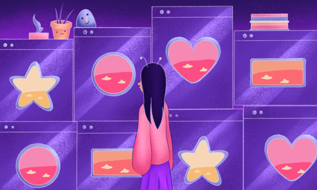
When creating the background art I thought carefully about the colour palette I was going to choose, I wanted the outside of the shop to have cosier feel reminiscent of vintage toy shops than the inside which I wanted to come across as more commercialised. I experimented with a contrasting colour palette, having the outside of the shop exhibit desaturated earthier tones whilst the inside has bright neon colours which resemble the sickly bright plastics used to create modern toys. The characters are coloured in pastels as well as the backgrounds, creating a disconnect between the complex real people children are and the stereotypical toys aimed at them.
All the toys in the film are created with felt, I did this to add some surrealism as well as portray them as these sort of alien objects which don’t truly reflect the real world.
elephant and castle collaborative project
Our group’s origin story for elephant and castle starts with a man late to a chess match, when he arrives one of his knights is missing so he uses a painted elephant souvenir from his home country of India to replace it. The man wins the match by checkmating the opponents king with his elephant piece and his castle piece thus giving Elephant and Castle its name.
My work on the project:
Illustrations I created for story development on the project, they tell the story of a man late for a competitive chess match who uses an elephant souvenir in his bag as one of the pieces. The two characters in these pieces are developped from my initial sketches
Short animation by me of the man from my illustrations turning his elephant chess piece around to reveal its form to the viewer. This was used as the introduction in the final video
POV project final film – intro to animation
by Frankie Moore
Insomnia
Overlapping action
3D Worlds
During week one of the 3D worlds rotation I focused on modelling and setting up the scene. There were a few ideas I had before I settled on a paranormal bathroom setting including a train station and the front of a house with an open doorway. I decided on the final location because I had a better story in mind to tell than I did for my other ideas. I began by modelling the features of a bathroom such as a bath and toilet as well as the walls and door of the room and then moved on to the trees outside. For my colour scheme I chose a bright triadic primary colour palette (magenta cyan and yellow) for the bathroom to create a simplistic and cartoony atmosphere that I thought would work well with the low poly medium. I also used a variety of vibrant greens outside to represent a rural landscape and extra terrestrial presence.
At the start of week 2 I added extra shapes and models to aid the storytelling focus of the week. These models included a UFO and cow as they were going to be key elements of the story. I focused on using forced perspective to make the environment optimal for the 2D storytelling medium of photographs instead of creating a more realistic background that could be used as a video game landscape. To do this I used 3 large spheres that were placed a lot further away from the camera so they’d look like hills when you looked out of the window from the bathroom.
My final 3 images tell the story of an alien abduction. In the first shot a person is in the bath, looking at the strange planet that has somehow joined them, a UFO can be seen out the window hovering over a cow. In the second scene we get a worm’s eye view of the cow being lifted into space by the UFO. The final picture shows the shadow of a ufo that can be seen in the bathroom as it has come for the person in the bath. The pictures begin with someone looking out the bathroom and ends with the alien looking in. Creating the first shot was tricky as I needed to make the UFO and the cow line up from the perspective of someone inside the bath, this took a lot of careful moving and learning how to return to the exact same perspective multiple times. For the final shot I had to edit the rim of UFO to create a better shadow as originally only the sphere part of the UFO could be seen, I did this by duplicating the rim and changing the angle of it, the combined shapes created a more readable silhouette. In the final 2 images I added a green light in the final two images to enhance the paranormal atmosphere. I also enhanced this atmosphere by making the water in the bathtub glow.
I enjoyed this rotation but found it pretty challenging and I predict it’ll probably be the hardest for me to grasp, I hope to keep practicing my 3D skills and improve them so they can be a helpful tool for my future animated projects.
Inspiring Walt Disney – The Wallace collection
For the second homework assignment i went to the ’Inspiring Walt Disney’ exhibit at The Wallace Collection. The premise of the exhibit was to showcase how the French Rococo period inspired the work of Walt Disney Studios when they created animated films such as ‘Beauty and the Beast’ and ’Cinderella.’
Peter J Hall was a concept artist on the Walt Disney film ‘Beauty and the Beast.’ Hall was a costume designer by trade and focused on creating historical costume designs for the film. He was tasked with creating the whimsical supporting characters of the Beast’s furniture. These characters are all anthropomorphised objects based on furniture items from the French rococo era. His original designs were elaborate in response to the stylings of the time period but were developed to become more symbolic for 2D animation later on.
I chose Peter J Hall as my main artist inspiration from this exhibition because I was captured by his ability to transform an inanimate object into a person whilst still keeping the design recognisable. I was inspired by the way he kept the shape of the original object yet still being able to translate it into a believable ‘alive’ character. In Hall’s original sketches for Mrs Potts, he was able to retain the shapes of a teapot in her design even after her transformation back to a human. This was achieved by giving her dress a unnaturally round appearance and her bonnet shaped like a teapot lid. He also does this in his design for human Lumière where he subtly mimics the swirling pattern created in his candlestick reference with the creases in the fabric of his clothes. The tight white sheet also manipulates his shape to replicate the top heavy form of the candlestick. This combination of subtle and more obvious choices makes them well thought out designs which are both immediately recognisable due to distinct features but also cleverly inform the viewer in a less direct way.
His design for Cogsworth the clock took inspiration from clocks made in Paris between 1690 and 1720. He was inspired by the already human-like proportions of the clock due to its height and ‘face’ to create the character. I particularly liked his use of the hands of the clock to emulate a moustache.
Despite the limitations of the 2D animation medium at the time, Hall’s designs would go on to influence Disney’s later live action adaptation of Beauty and the beast in 2017 along with the other elaborate rococo pieces that initially inspired his work.
In this sketch I was inspired by one of the rococo pieces at the exhibition to create an environment and character based on it. The shape of the piece was reminiscent of a ship so I created a pirate character with clothing details inspired by the patterns on the pottery. I imagine the lion figurehead on the bow of the ship to be alive.